
Through these first few posts I will be discussing the three C's of creative image making: Communication, Composition and Craftsmanship. My first journal entry was about Communication and how we are inspired, this next entry will be drawn from the second category of Composition.
Proper use of values is an often overlooked asset of photography. Seeing and understanding values can really give your pictures what it needs to take your photography to the next level. Simply think in terms of three different values. Dark values mid tone values and light values. You can see the use of values in both color and black and white images. Begin with a black and white photo to more easily see values in terms of black, gray and white. Ansel had 10 value steps in his zone system but I'm going to simplify it to 3 so we can see the impact this can have on your images.
First, the most boring pictures are made up of a balance of 50% of one value and 50% of another value see example #1 below.

To improve the image we will add in a mid tone value and break up the 50/50 symmetry, but now notice that the black and grey are the same amount and the two combined are the same as the amount of black. Example #2.

Now lets step it up a notch and make it even better by using three disproportionate values, they are different in the amount or volume of the value. This will greatly improve the interest in a composition. Example #3

But, still the gray and black make up half of the volume balancing the white. Rarely achieved but the most impactful, example #4 is the optimum for creating interest. Where all values are different and there is one that dominates.

You can mix up any of the values with each other, it doesn't matter which is dominate, it could be white or it could be gray as well, but the value with the least amount of volume will become your subject. To make your subject stand out you make it the value that is the least amount of the three.
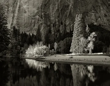
This image of the Merced River is a good example of the least value being the subject. The trees lit with the side light are in the least value and become the subject. The dominate value is mid tone grays and black or the low value is the second.
Here is the image in graphic form using the three values.

It can be hard at first to see values because we see in color, but keep practicing and it will come naturally to see that way. Shooting with the importance of values really takes a conscious effort, so put on your thinking caps and shoot intentionally!

Go out and have some fun and see the value of this technique. If you have any questions feel free to contact me.